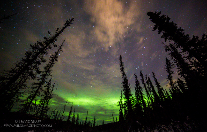
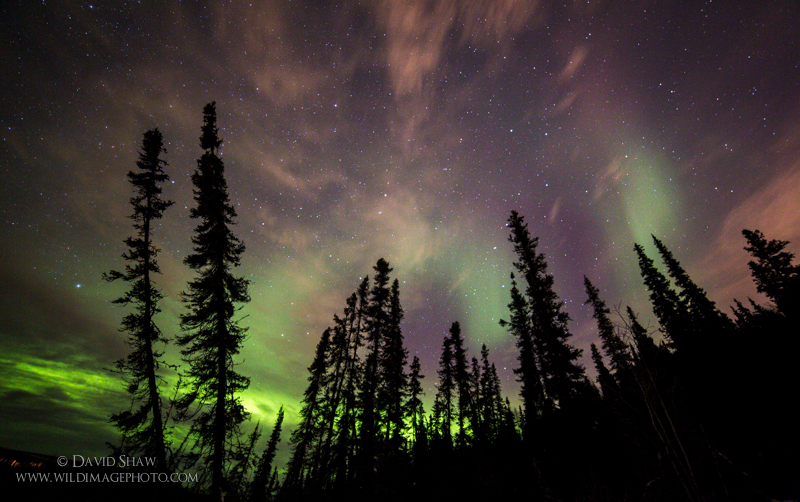
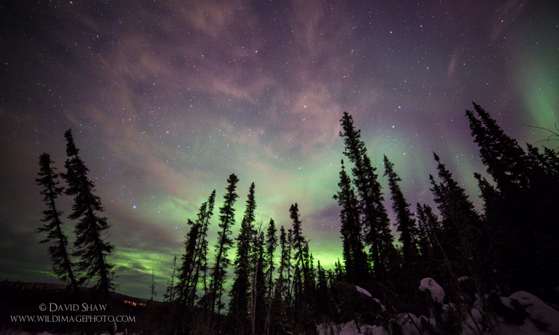
Balance is a vital, and under appreciated aspect of photographic composition. I was reminded of this fact just the other day when we were treated to a short, and lovely display of the aurora borealis. It wasn’t a particularly booming or bright display, but there were some scattered, high clouds that provided a different and colorful element to the evening. Of the dozen or so photos I made, I selected three for final post-processing. As I was choosing which of the three to share on my Facebook page, I flipped back and forth between the images. And though all three share similar skies, two struck me as better than the third. The third had good color and contrast, but there was something about it, that just seemed, well, wrong.
It wasn’t until today that it occurred to me why that image didn’t work as well as the others: it was unbalanced. Balance is strange thing in photography because it has to do with visual weight, not just size. While the subject warrants much more than I will put toward it right now, these three images show the importance of balance quite clearly.
Take a look at the image up top. It is equally balanced. The trees on right and left are more ore less equal in size and distribution, creating a nearly U-shaped curve. Because of this, the composition works easily.
Now take a look at this one:
This image is not equally balanced between the two halves of the frame, but it more or less retains relative visual balance. The trees are more abundant and dense on the right side of the frame but the two trees on the left are dominant, taller and more visually striking. This balances the impact of the trees on the right.
Here is the third image:
This one actually shows the same cluster of trees as the previous image but from a bit further back. This image is notably off balance. The trees on the right dominate the frame, the two left hand trees not large or visually compelling enough to sufficiently balance that aspect of the composition. Just as importantly, there is patchy snow visible on the lower right adding visual weight to the already heavy right side of the frame. If there was a scale under this image it would tip precipitously to the right. It results in a visually uncomfortable image, even though the aurora and sky is just as compelling in this image as the previous two.
When composing your images, think about the visual weight and how it influences balance in the image. The viewers eye will be drawn to the heavy areas, if that is one side of the frame dramatically more than the other, the viewers eyes are likely to slide right off.


