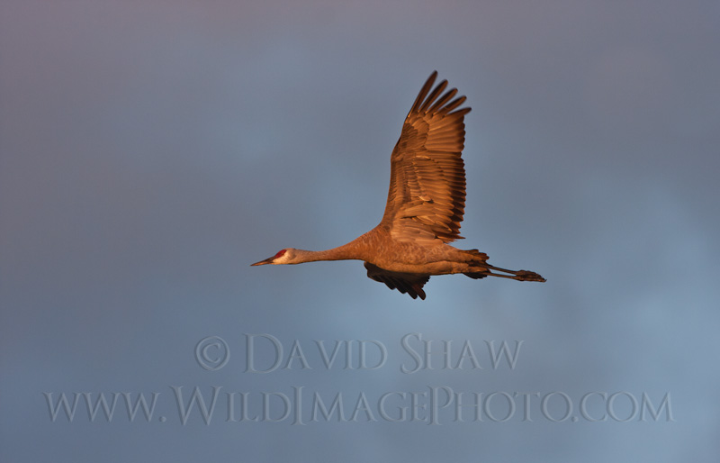
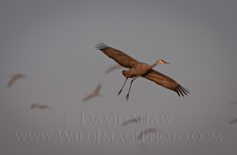
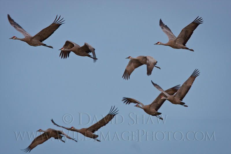
Today we come back to my retrospective of bird images and feature the Sandhill Crane. Each autumn, Fairbanks is fortunate to host several thousand cranes as they stage for migration. In the last days of August the Creamer’s Field Migratory Waterfowl Refuge is packed with birds, and it is one of my favorite times to be out making photographs. These four images were all made in the same season, but each succeeded or failed for different reasons.
The top image is simple and successful. It is a sunrise shot, the bird is nicely silhouetted and sharp. The profile is so perfect in fact that you can see right through the nostrils on the bird’s bill to the colorful clouds on the other side. I’ve never had that happen before this image, or since (though I’m not sure you can see that in this smaller version). I exposed off the bright clouds and snapped the image. Simple. However, had I metered off the bird itself, it would have been a much slower shutter speed, blurring the crane and blowing out the background resulting in a failed image. I haven’t done much in post-processing except crop the image slightly, and add some contrast. Overall it works out just fine, and I’m pleased with the shot.

This second image was made in the evening and features the very low angle sunlight hitting the underside of the bird. This image too is a basic and straight-forward flight shot. Cranes are great subjects for flight photography because they are big, fly slowly and often close to the ground, allowing much easier focusing and composition. Had the light not been as good, this would have been a mediocre shot at best, one I may not have opted to keep. (See the final image for a lighting comparison.) As it is, the image is nice, I like the bird’s pose and it’s sharp. There is texture in the clouds in the background which provides a bit more interest than a clear, blue sky. In fact, I’ll take clouds over a blue-bird sky any time when it comes to wildlife photography. The verdict? A solid image, well lit.
This next image is mostly successful but for a very different reason. The lighting is not nearly as good as the previous image, rather gray, with a touch of sun on the lower bird. But it is the flocking birds in the background that make the shot work. This let’s the image tell a story, provides a sense of scale and hint of the abundance found during the fall migration. I don’t like the empty space in the top 1/4 of the frame. It isn’t really enough to provide space for copy, but it is enough to appear empty. I’ve tried cropping the image to eliminate that area, but I haven’t liked the resulting frame shape. I could have greatly improved the image by composing it with the focal crane in the left side of the frame, a bit higher up, which would eliminate much of the empty gray sky, and shown more of the birds flying in the background. The verdict? Good and interesting, but with some major flaws.
This final image I include as an example of one with several flaws. Though the image is generally sharp and the flock of cranes is in a nice formation, it is rather boring image. The background is just empty blue sky. No cloud patterns, no color, just blue. Boring. the birds themselves are flatly lit and lacking interest. Again, boring. This really demonstrates the importance of light in photography. Good quality light can make or break an image, and this one broke.
All of these images and several others of sandhill cranes are available for sale as prints or digital downloads on my stock site. Click here to check them out.
Related posts:
A photo essay of mine on the bears of Katmai National Park was just pub...
The forest has grown quiet around my cabin. It’s been happening for m...
I've made it pretty clear though my many posts about them (like here, h...


